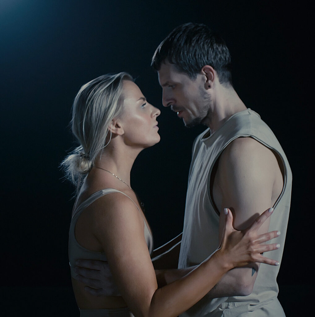
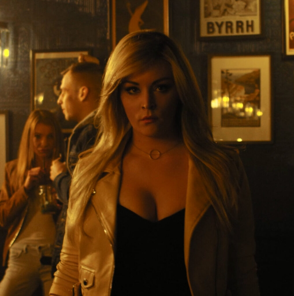
Feature films
Visual Effects in feature-length
films
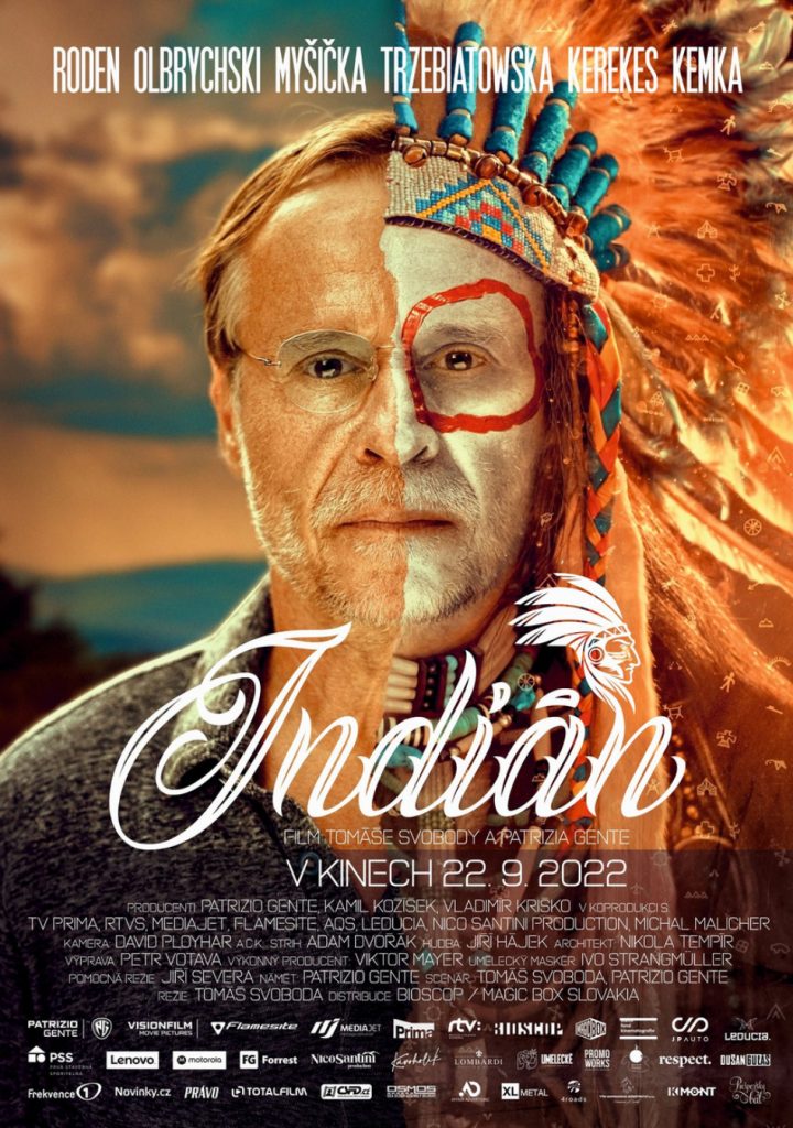
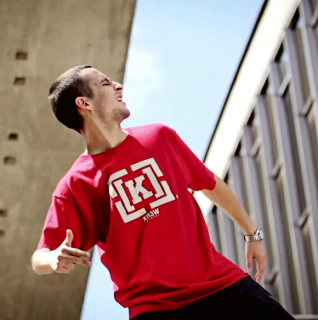
Indian
Year: 2022
9 shots
Famous Czech and Slovak actors (Karel Roden, Martin Myšička, Lukáš Latinák, Juraj Kemka, Vica Kerekes) starred in this feature-length comedy. We worked on post-production to enhance the scene with the dying grandmother. During the long takes, the actress was unable to hold her breath for that long, so we retouched her chest movements and facial details throughout the sequence to make her appear dead. We collaborated with Flamesite, a Czech production company, on the film.
For more info about this movie click here.
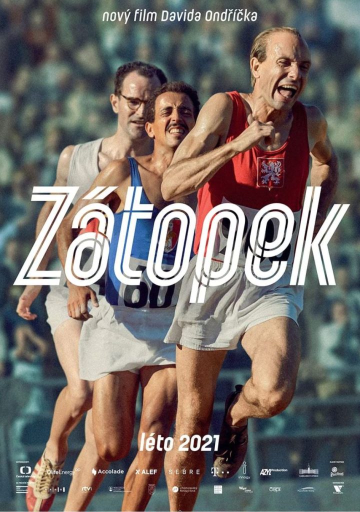
Zátopek
Year: 2021
66 shots
The Czech feature film has garnered high acclaim both locally and internationally, receiving 10 Czech Lion awards and an Oscar nomination for the Czech Republic. The biographical film chronicles the life of a legendary athlete during the first and second halves of the 20th century and features period-accurate costumes and film sets. However, due to budget constraints, it was not always feasible to create a historically accurate environment during filming. As a result, we made necessary adjustments during post-production. For instance, we removed air conditioning units and replaced modern windows with wooden ones in scenes filmed on the streets of Zlín. We also replaced modern lighting with period lamps and altered the facade of buildings in group scenes with runners. We digitally removed all 20 runners, fine-tuned the surroundings, and then placed the runners back in the scene. In the airplane scene, we filmed a real plane that was used during Zátopek’s era and is still flying today. To give it a period-accurate look, we digitally replaced the current markings on both the airplane and runway with the old ones.
Our work was done in collaboration with Studio 727, which worked in tandem with the Czech Visual effects house PFX.
For more info about this movie click here.
Trailer:

Perinbaba a Dva svety
Year: 2019
VFX look developement
Perinbaba is one of the legendary Slovak fairy tales. Its director, Mr. Juraj Jakubisko, is one of the most renowned Slovak film creators. We were delighted to be among the first to be approached for collaboration on its sequel. We helped create initial visuals for important effects, to ensure clear planning and execution of production. We consulted on our designs in joint meetings with the director and production team. We collaborated on the film with Studio 727.
For more info about this movie click here.
Christmas Wish
Year: 2018
52 shots
The feature-length fairy tale directed by Peter Bebjak was created in a Czech-Slovak co-production. It starred well-known actors Tomáš Maštalír, Lukáš Vaculík, and Csongor Kassai. In our studio, we prepared all the magic associated with the negative character of the king’s advisor Svarog – from the initial design to the final render. Svarog’s magic was accompanied by black, thick smoke and floating embers resembling ashes or burnt pieces of paper. We created these effects to match Svarog’s movements and intentions. Final compositing was done by Studio 727, which invited us to this collaboration.
For more info about this movie click here.
Trailer:
Red Billabong
Year: 2016
+/- 50 shots
This Australian horror film was produced in a collaboration between Australian and American teams. The main antagonist, a monster called Bunyip, inspired by an Australian legend, was entirely created through computer graphics by the team at Vertex Creation. After designing and animating the character, we were invited to join the project to handle the shading and lighting of all the interior scenes with Bunyip. We replicated the lighting from the on-location environment in which the film was shot, so that the monster fit seamlessly into the scene. By creating the illusion that it was part of the filming process, we helped to bring Bunyip to life. Overall, our studio worked closely with Vertex Creation studio on this project, focusing specifically on the monster’s shading and lighting.
For more info about this movie click here.
Trailer:
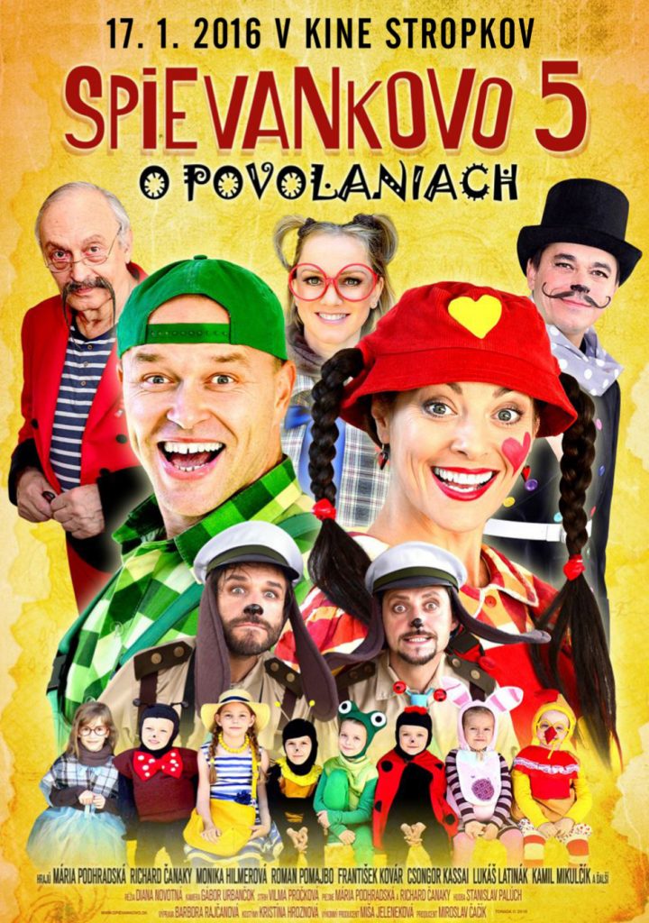
Spievankovo 5: O povolaniach
Year: 2015
3 shots
In a popular Slovak fairytale featuring an all-star cast including Roman Pomajbo, František Kovár, and Lukáš Latinák, some characters were required to fly. To achieve a realistic effect, the actors were suspended in the air by ropes during filming. However, to remove the ropes in post-production and make the flying effect seamless, we had to meticulously retouch each frame of the film. This is a time-consuming and challenging process that demands a high level of skill and attention to detail. Despite the difficulty, we possess the necessary expertise and patience to bring your creative vision to life. Even popular AI tools are unable to accomplish this. But fear not, for we have the skills and patience needed to bring your visions to life!
For more info about this movie click here.
Trailer:
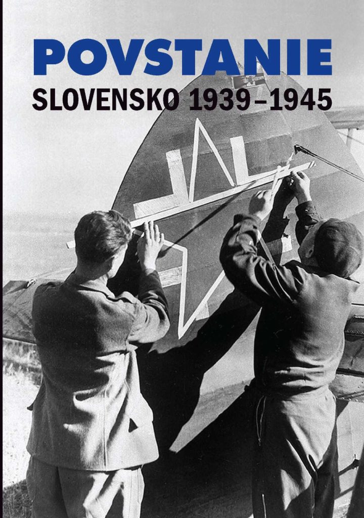
Povstanie Slovensko 1939-1945
Year: 2013
+/- 30 minutes
This documentary film was created to commemorate the 70th anniversary of the Slovak National Uprising. The film utilizes real archival black and white footage. In a sequence lasting approximately 30 minutes, we digitally colored selected objects, such as uniforms. We carefully cut out and colored specific parts of the footage frame by frame, using digital software tools and a graphic tablet. We were invited to join the post-production team by BeOnMind studio, and we are proud to have contributed to this important historical project.
For more info about this movie click here.
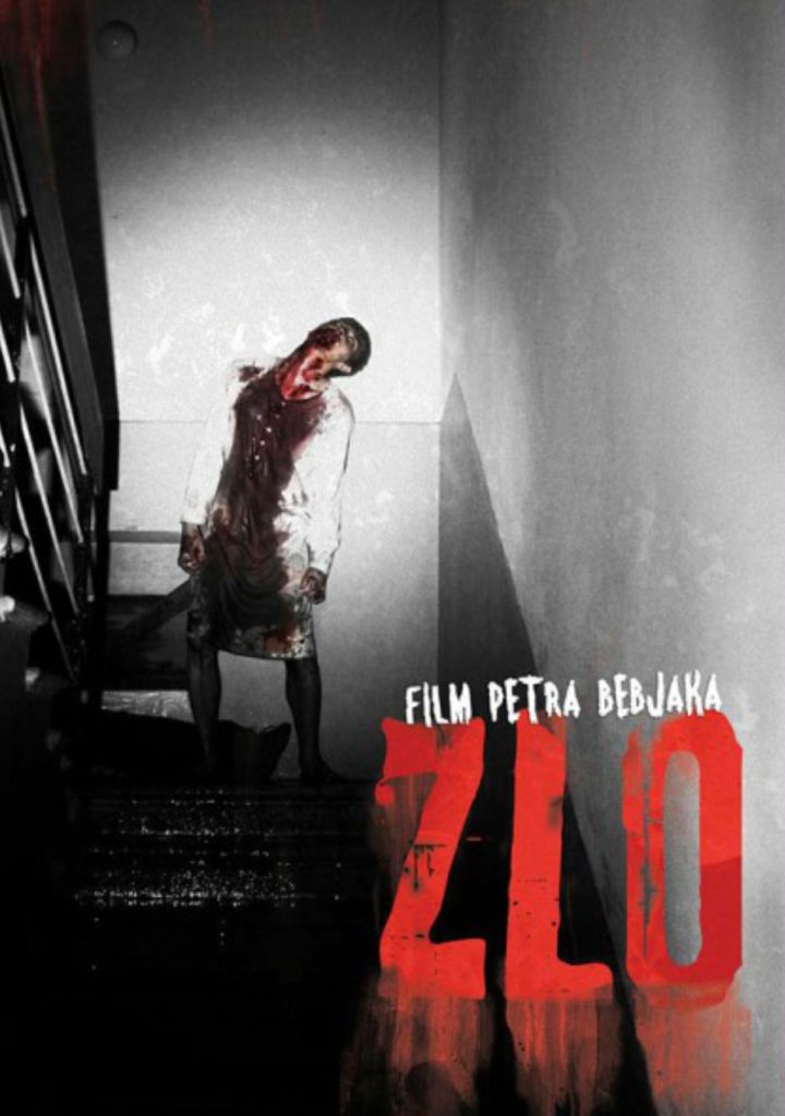
Evil
Year: 2012
+/- 10 shots
Director Peter Bebjak’s Slovakian horror film is made in the style of the Blair Witch Project. The movie was shot with a handheld camera to create the impression of authenticity. We worked on the film’s minor details to ensure that everything matched the plot. For example, in one scene, the main character looked through photos, which the production team later decided to replace with other ones. As a result, we digitally replaced the photos and recreated their movement in the image, along with the camera’s motion blur, lighting, and digital noise, due to the dynamic camera work in low light conditions. We were invited to collaborate on this project by Studio 727.
For more info about this movie click here.
Trailer:
Short films
Visual Effects and Color Grading
in short films
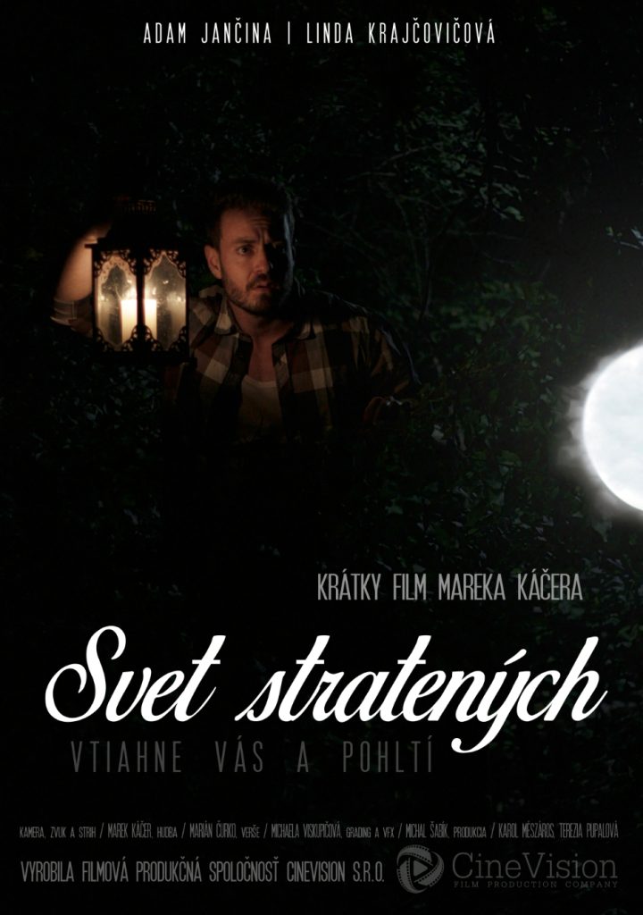
World of the Lost
Year: 2020
Color Grading + 12 vfx shots
During the COVID period, we helped to create a short authorial film by Marek Káčer. The director wrote a simple ballad, prepared a screenplay, and filmed the movie himself as a cameraman. We used several visual effects in the film, including visible ones such as dead souls underwater or flying light. In some shots, we also used subtle invisible effects, such as modifying the facade of a building in the background of a lake or a photo of a deceased girlfriend in the houseboat at the beginning of the film, which was added later because the production had not yet selected an actress during the scene shooting. The film was produced by CineVision, a company focused on creating short fiction films, with whom we have been working with for a long time.
For more info about this movie click here.
Short movie:
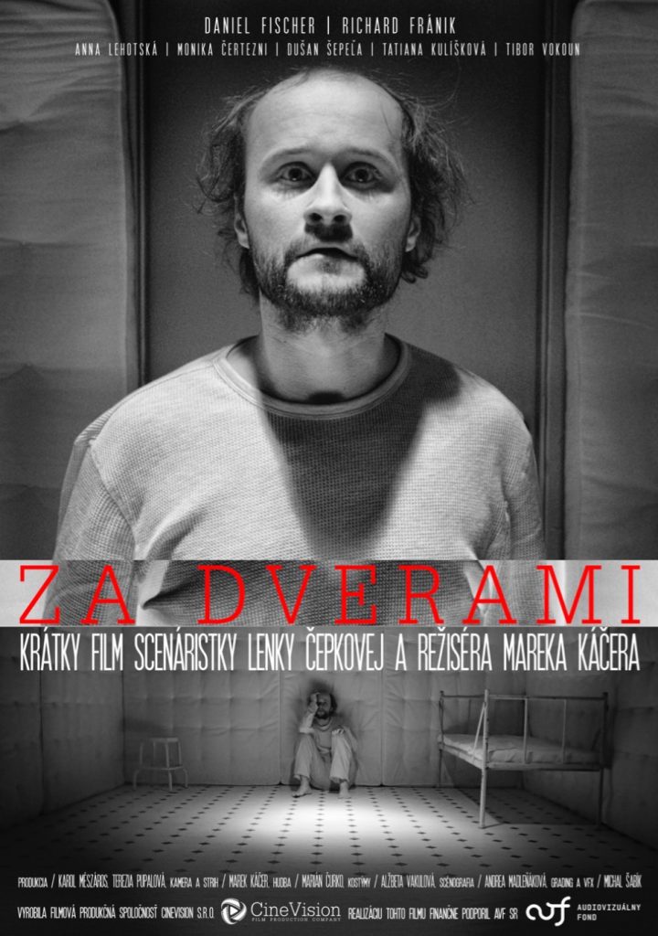
Za dverami
Year: 2019
B&W Color Grading, relighting and adding elements
Marek Káčer’s short psychological thriller creates ghosts that appear in the mind of the protagonist. In the film, we used a striking black and white color grading and enhanced the lighting conditions that were not possible during filming. We took care of both visible and “invisible” visual effects, such as stabilizing the set so that the viewer does not see the wall shaking when the character hits the door, as well as visible effects such as blood that follows the actor from under the door. The production company CineVision premiered the film at the Lumiere cinema in Bratislava, from where it went on to other Slovak cinemas.
For more info about this movie click here.
Short movie:
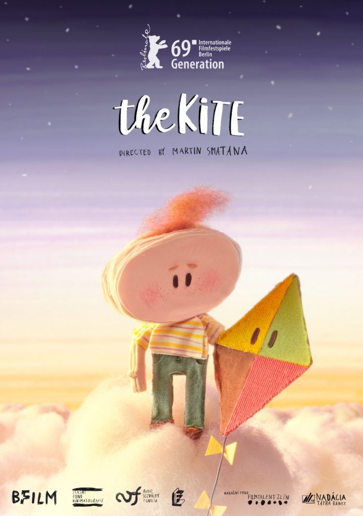
The Kite
Year: 2019
101 vfx shots and Color Grading
The short animated student film by Martin Smatana has gained international recognition, won dozens of awards, and now holds a distinguished place in the Museum of Modern Art in New York (MoMA). The film’s phenomenal success is due to the excellent storyline and the dedicated work that was put into it. Additionally, the high-quality post-production, which we completed in our studio, was an integral part of the film’s success. The director, Martin Smatana, and cinematographer, Ondřej Nedvěd, also contributed their skills to post-production. This Czech-Slovak-Polish co-production was filmed partially in the prestigious Polish studio CETA, with many scenes filmed on a blue background. We made visual adjustments to over 100 shots to harmonize the background with the stop-motion animation, which was captured frame by frame. This created a smooth and cohesive whole that demonstrates how crucial quality post-production and visual effects are in the film industry. They can enhance a good idea and elevate it to unimaginable heights. The film premiered at the Berlinale International Film Festival and has since achieved remarkable success.
You can find the complete list of awards and nominations here and more information here.
Trailer:
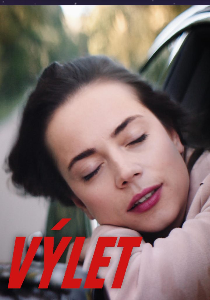
The Trip
Year: 2018
Color Grading + 6 vfx shots
Daniel Rihak’s short film, which was nominated for the British Academy Film Awards (BAFTA) student film shortlist, has won the awards for Best Directing and Best Sound at the Acko student festival. Our studio provided complete visual post-production services, which involved color grading and vfx. We skillfully adjusted the lighting in scenes that were shot on a boat at Strbske Pleso, since proper lighting was not possible during filming. In addition, we created few visual effects shots, such as adding reflections of the landscape to a car window, and made a few retouches. We also made minor adjustments, such as enhancing the display of a mobile phone to make its contents more legible.
For more info about this movie click here.
Trailer:
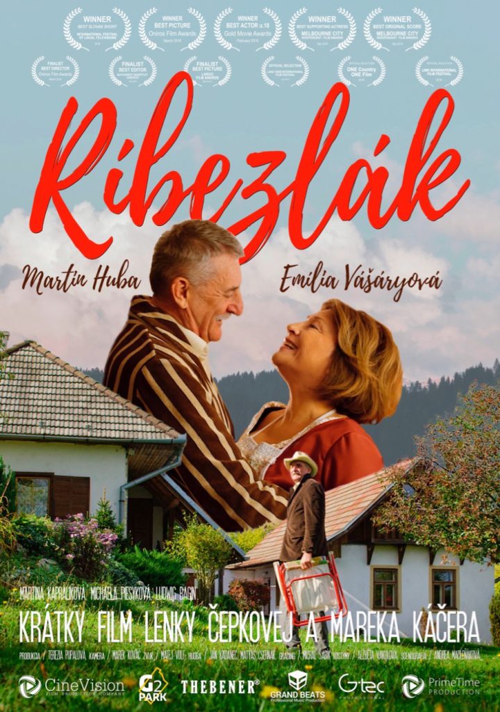
Ríbezľák
Year: 2017
Color Grading + 4 vfx shots
The short film, directed by Marek Káčer and produced by CineVision, features renowned Slovak actors Martin Huba and Emília Vášáryová in the lead roles, and has received recognition at both national and international festivals. We used strong color grading to enhance the film’s unique blend of cheerful and melancholic tones. Our team also provided both invisible and visible visual effects – for instance, we retouched a crew member who was holding a fence to prevent it from falling while the actor jumped over it, and we created a fly that wakes up the main character at sunrise by not only using sound, but also by flying around in the shots during the opening scene.
For more info about this movie click here.
Short movie:
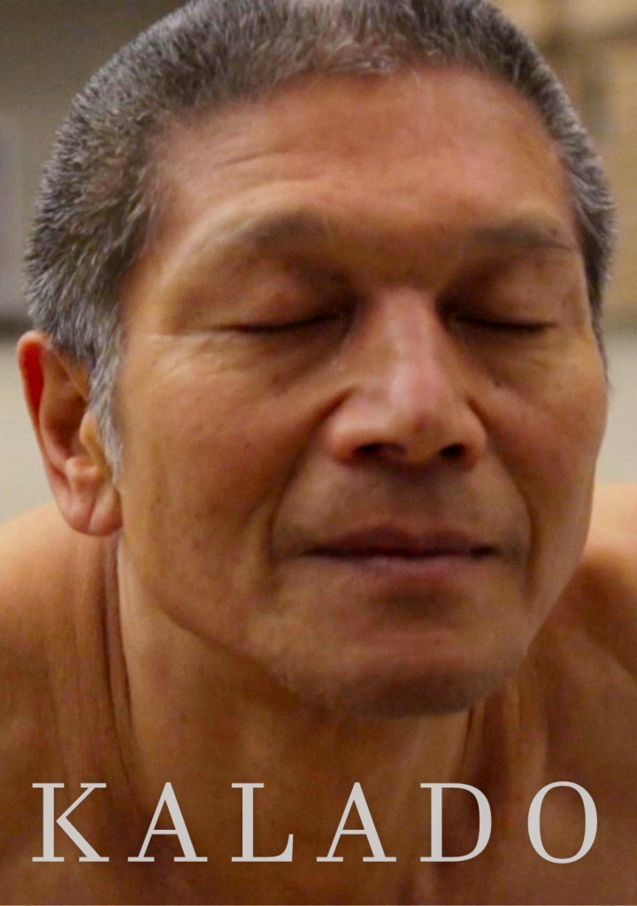
Kalado
Year: 2017
+/- 10 shots
Tereza Tara, a graduate of FAMU, directed a stylized documentary film in which we restored images that were damaged during recording on a memory card. Utilizing the expertise gained from working at the film institute, where Michal Šabík, the founder of our studio, developed digital tools for restoring old films, we were able to recreate the footage to match the original images. The end result is a newly restored image that accurately reflects the original footage.
For more info about this movie click here.
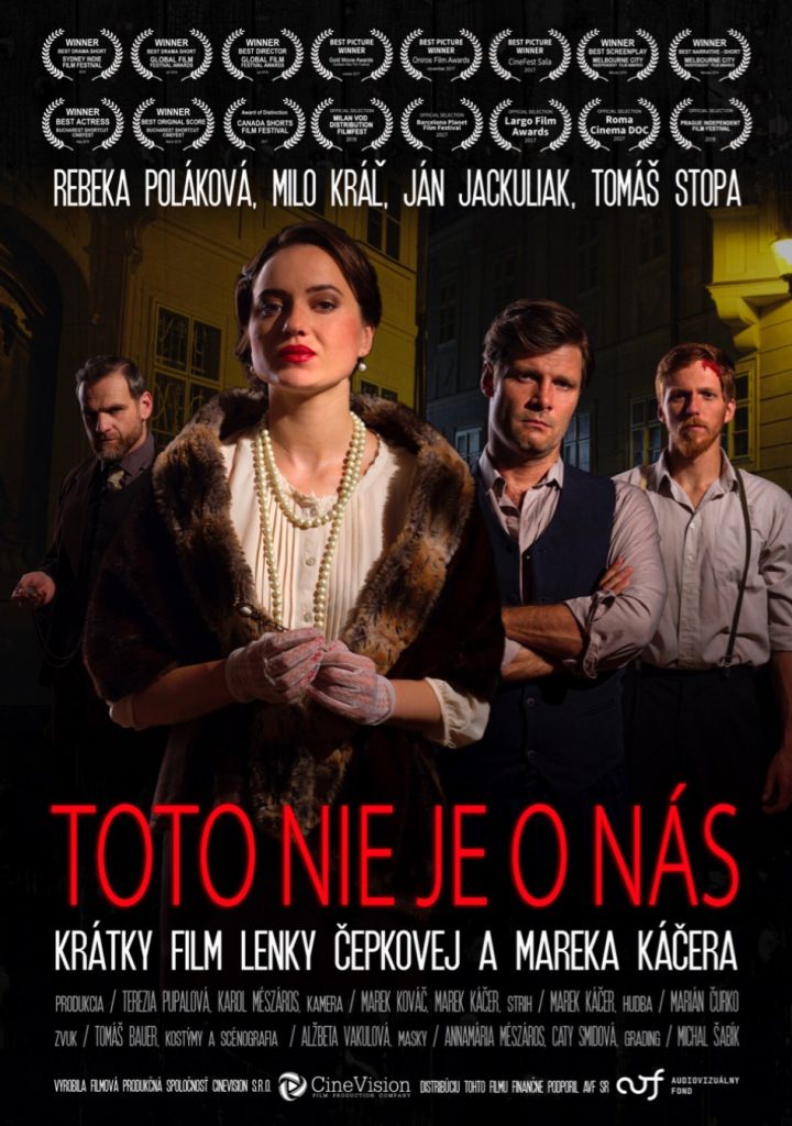
This Is Not About Us
Year: 2017
Color Grading + 4 vfx shots
The CineVision-produced short historical drama directed by Marek Kácer has been showcased at numerous international film festivals and has earned recognition in Sydney and New York. Our team ensured that the color grading of the footage aligns with the director’s vision of the first Czecho-Slovak Republic era. We also implemented subtle visual effects, such as removing street names to enhance the film’s authenticity and accuracy.
For more info about this movie click here.
Short movie:
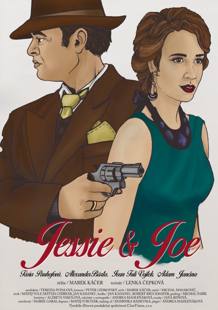
Jessie&Joe
Year: 2017
Color Grading + 2 vfx shots
The short gangster comedy was produced for the 48 Hour Film Project 2017, an international competition in which each crew had to create a film within a 48-hour time frame. The film featured popular actors Táňa Pauhofová and Alexander Bárta. We took care of color grading to achieve a bold color palette that suited the film’s comedic and quirky tone. We also added invisible effects, such as hiding the policeman until he emerges from the forest, and made minor modifications, such as retouching license plates and enhancing headlights.
More information about this interesting short movie can be found here.
At a Toothless Elephant
Year: 2016
Color Grading + 1 vfx shot
This short film won the Audience Award at the global 48 Hour Film Project competition, which involved writing, shooting, editing, and color grading within a two-day timeframe. We handled the color grading by strategically shifting, saturating, and stylizing colors to complement the comedic acting in the film.
For more info about this movie click here.
Trailer:
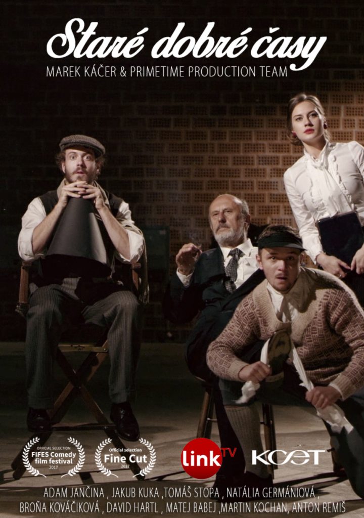
Good Old Times
Year: 2016
Color Grading + 6 vfx shots
Marek Kácer’s short period comedy takes inspiration from silent film and old advertising visuals, and features a multitude of visual effects. One notable example includes our use of compositing techniques, where we replaced the greenscreen behind the actress inside a 1940s car with a separately shot background. We also improved the fictitious movie theater in the film’s finale, and employed color grading techniques throughout to achieve the desired atmosphere and aesthetic.
For more info about this movie click here.
Short movie
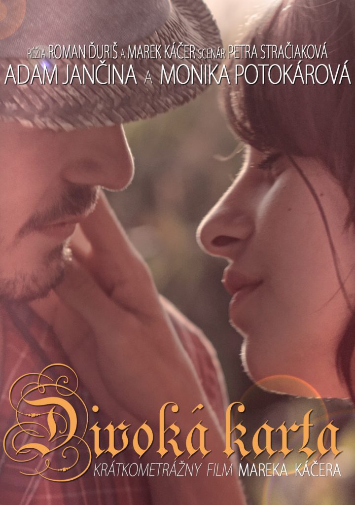
Wild Card
Year: 2016
Color Grading + 2 vfx shots
Marek Káčer and the CineVision production company collaborated to produce a short poetic road movie. We enriched the film’s summer ambiance through color grading, employing warm-toned colors. In addition, we incorporated basic visual effects in the film, including digitally manipulating the equipment in the cafe and altering the protagonist’s ID card information.
For more info about this movie click here.
Trailer:
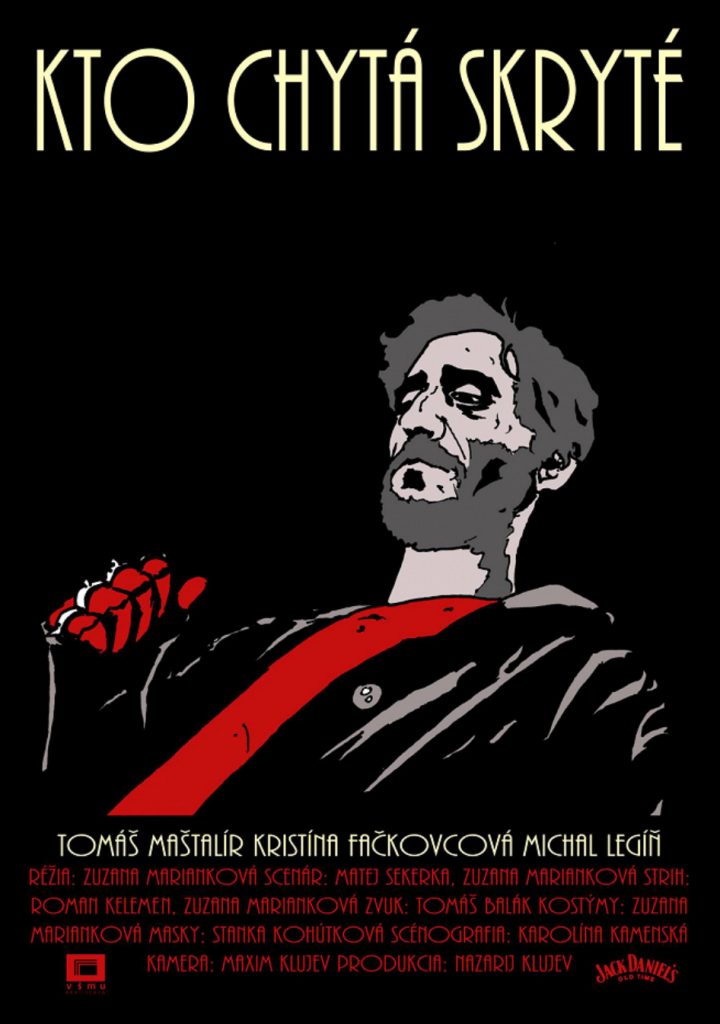
Kto chytá skryté
Year: 2015
Color Grading
Zuzana Mariankova’s student film, a gangster drama shot in film-noir style and starring actor Tomáš Maštalír, was shot by cinematographer Maxim Kľujev for his bachelor film in 2015, with his brother Nazarij Kľujev producing it. Despite being a student project, the filmmakers aimed to achieve a professional post-production look, so they enlisted our color grading services to adjust the colors of the image to match the overall atmosphere and mood of the film. Today, Mariankova is a sought-after and award-winning filmmaker who continues to direct, including television work.
For more info about this movie click here.
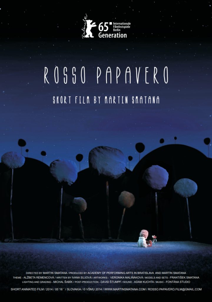
Rosso Papavero
Year: 2014
On set lighting and Color Grading
Martin Smatana’s short stop-motion animation film has been recognized with numerous international awards, including a premiere at the Berlinale film festival. Smatana produced the film during his studies at VŠMU, with TeapotVFX founder Michal Šabík contributing as the main gaffer during production and handling color grading in post-production.
For a comprehensive list of the film’s awards, please click here.
Short movie
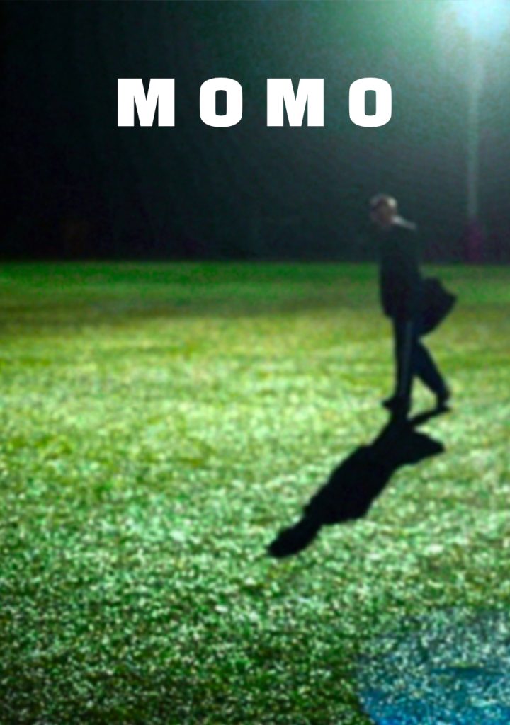
Momo
Year: 2012
+/- 5 shots
The short drama by Teodor Kuhn, which won the award for Best Short Student Film at the RIFF Independent Film Festival in Rome, involved adding bars to the windows of a building that represented a prison, via visual effects. Since the building appeared in both day and night sequences, we ensured the effect was consistent and effective in different lighting conditions.
For more info about this movie click here.
Short movie
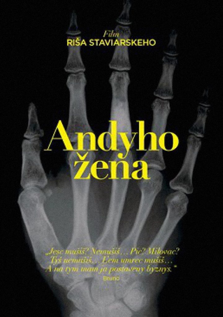
Andyho žena
Year: 2012
Color Grading
Richard Staviarsky’s short tragicomedy was a collaboration with VŠMU and was shot on a Canon 5D MK II digital camera, which marked the beginning of using still photography-focused cameras for shooting films. In post-production, we color graded the material to create a “filmic” look and feel.
For more info about this movie click here.
Short movie:
TV shows
Visual Effects and Color Grading
in TV Shows

Einstein
Year: 2022
Compositing, Paint, Roto – 9 vfx shots
In the first three episodes of the Slovak crime series Einstein, we delivered interesting VFX – from a dramatic apartment explosion and glass doors shattered by a drone to seamless enhancements of on-set SFX. We removed safety gear, added cinematic elements, and helped bring the director’s vision to life. Produced by TV JOJ, the show is a Slovak adaptation of the hit 2015 German series Einstein.

Mr. Tupelo show
Year: 2021
Roto, Key, Paint, Compositing – 42 vfx shots
For the talk show Mr. Tupelo Show, we created digital background enhancements for the first season. The effect itself wasn’t a major design or technical challenge, the production had provided well-prepared source materials, but the real challenge was maintaining a consistent visual look across most shots in episodes that ran for about 45 minutes each.
To efficiently handle the workload within the targeted budget, we categorized each episode into shot types based on how they were filmed in the studio, treating all shots of the same size and composition as a single VFX shot. This approach, combined with extensive use of AI tools to speed up repetitive tasks such as creating roto masks, allowed us to maintain both quality and deadlines. The project was carried out for the production company Jumpcat, for whom we also created the show’s opening sequence and later provided several follow-up consultations.
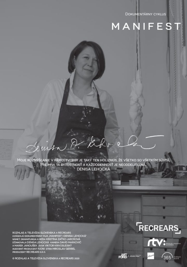
Manifest
Portréty slovenských výtvarníkov
Year: 2020-2023
Color Grading – several episodes
The “MANIFEST” series is a collection of short documentary films featuring prominent Slovak artists, produced by Slovak Television over the course of several years. Our task is to ensure that the visual representation is consistent and coherent throughout different episodes and locations, despite the varying types of cameras used to capture the documentary material.
For more info about this TV series click here.
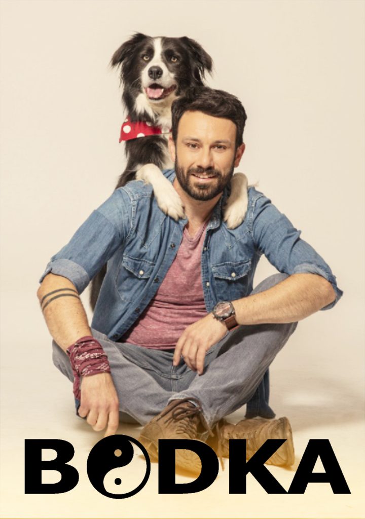
Bodka
Year: 2019
Motion capture, Matchmove, Compositing – 355 vfx shots
The JOJ television’s detective series in Slovakia features a unique protagonist – a talking dog. To make the dog’s speech seem as realistic as possible, trained dogs with similar appearances were used during filming. The dog received instructions from its trainer off-camera, and when it was necessary for the dog to talk, its muzzle had to be animated. We used match-moving and MOCAP techniques to accomplish this. To create the animation, an actor spoke the dog’s lines, and the mouth movements were analyzed as a basis for animating the virtual model of the dog. We stabilized the image of the dog’s snout and placed the virtual puppet on it. The rendered animation of the muzzle was then superimposed on the real dog in each shot of the talking dog throughout the series. This process was repeated for every instance of the talking dog in the series. We collaborated with Studio 727 during this project.
For more info about this TV series click here.
Trailer:
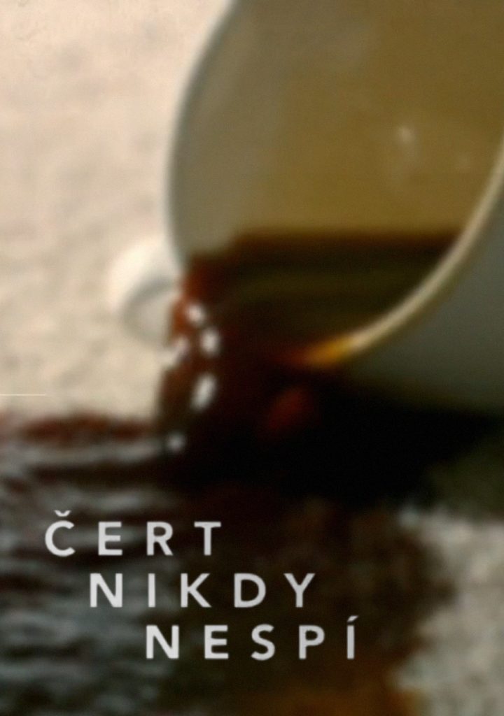
Čert nikdy nespí
Skutočné príbehy
Year: 2018
Color Grading – several episodes
This Slovak JOJ TV series is based on themes suggested by the audience. In order to meet the demands of a fast-paced television environment, we had to color grade one hour of footage in just four hours. Our main objective was to unify and correct the color in the images, ensuring that the multiple cameras used during filming were harmonized as much as possible. The end result needed to look like a cohesive cinematic work.
For more info about this TV series click here.
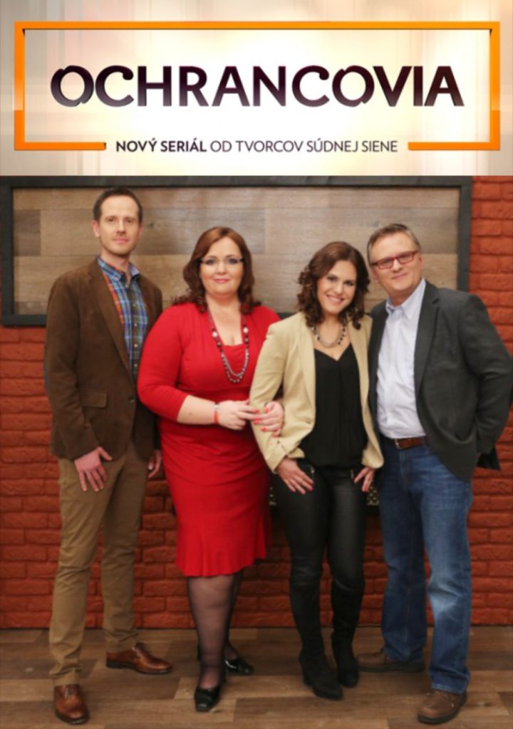
Ochrancovia
Year: 2018
Color Grading – several episodes
The Slovak JOJ television series offers guidance on resolving disputes with the court or the police through mutual agreement. Despite the fast-paced nature of TV production, we were able to quickly prepare the color grading for the latest episode. Our approach involved unifying the color scheme of the footage and adding simple color grading to enhance the visual style. We aimed to ensure that the multiple cameras used to shoot the episode were harmonized to create a cohesive and seamless final product.
For more info about this TV series click here.
Advertisements
Visual Effects, Color Grading, 2D and
3D Animations in Advertisements
Kraj
Year: 2022
CGI – 3D Animation
Production: DIGITRIXX
We collaborated with post-production studio Digitrixx to produce three CGI spots featuring animation and simulations. Our studio was responsible for creating the visual content of the spots, from design to the delivery of rendered 3D animation. The campaign was centered around a butterfly, which is the central motif of our client, Kraj food network. The client wanted to promote individual foods such as baked goods, fruits, and milk, while continuing to use the butterfly element. In the animation, two pastries collide and form a flour butterfly, a fruit transform into a fruit butterfly and a milk to a milk butterfly, each made up of corresponding food products.
To create these animations, we used 3D scanning technology to digitize real products from Kraj food counters and create realistic 3D models of baked goods and vegetables. We also created virtual 3D models of the butterfly and the surrounding elements, and animated them to simulate the effects of a cloud of flour, a swirl of fruit, and the collision of two streams of milk.
Once we had completed the 3D animation, post-production studio Digitrixx took charge of the final compositing and 2D animation of the graphics. This collaboration resulted in a series of stunning 3D animated clips for the Kraj food network, which were launched in 2022.
Sokra
Year: 2021-2022
CGI – 3D Animation
Agency: Zaraguza
We produced a series of three animated CGI commercials from scratch. We went through the entire creative process from dissecting the literary script to creating storyboards, 3D characters and environments, making animatics, all the way to color grading, material finalization, animation, and rendering. In addition to the visual and content aspects, we also provided sound production, post-production, and video editing.
After approval of the storyboard, we created a separate animatic for each commercial. This is a simplified animated version of the final clip without the final lighting, color, materials, or environment. However, the animatic is an extremely important step in the creation of 3D commercials because it contains the timing of each action. The client gets an idea of the length, pace, and rhythm of the future animation. It also serves as a template for creating sound effects and music. Since commercials have a set time frame, syncing the content and timing is crucial.
As all content is laboriously created frame by frame for 3D animated commercials, the animatic is a space for clarifying the exact appearance of the commercial, which saves time and budget. Alongside creating storyboards and animatics, we worked on the visual design of the 3D characters and figurines. We started with sketches and materials provided by the agency, and created designs based on the basic idea. After approving the 3D models, we then created the so-called rigs for them and prepared them for animation. In parallel with the characters, we designed and modeled the scenery. In this case, it was a fictional talent show for tuna, where the judge selected the best tuna for Sokra products.
The next step in the process of creating an animated 3D commercial is look development. This involves fine-tuning the character models and scenery using materials and textures, whose approval in this project was combined with creating presentation images for social media, where the judge character posed in a specific lighting situation. This is followed by final animation according to the animatic and lighting, followed by rendering. After this step, we work with a 2D image, so the steps of compositing individual elements and final color correction follow. We were approached by the creative agency Zaraguza to work on the campaign for Sokra client in 2021.
ČSOB
Year: 2021
Color Grading + VFX
Agency: MUW Saatchi & Saatchi
Production: Filmaari
Our studio collaborated with Filmaari, a production studio, in 2021 to create visual effects and Color Grading for various advertising campaigns such as Insurance, Hell, and Burger. For the promotion of Spirit accident insurance from ČSOB, our studio focused on Color Grading in a series of videos that featured a professional stunt rider on a bicycle demonstrating techniques to prevent injury in case of a collision with a car or a fall from a bicycle. As different cameras were used to shoot the footage, we ensured a consistent look by applying technical color corrections and creative grading. This involved adding a blue color palette, highlighting the actor’s face, and enhancing the overall image quality.
For the Inferno project, which was an ad for a bank account and socially responsible investing, we implemented creative visual effects and Color Grading. We combined our own visual effect of a burning tree with a special effect of a real burning tree to create a realistic effect. Additionally, we created a thermal camera view using visual effects to give the clip a unique stylized look. This involved selecting individual colors and brightnesses and assigning a temperature scale to create our own color scale that resembled a thermal camera view.
In the Burger spot, another advertisement for the CSOB bank account and investing, we used creative Color Grading to create a fictional future where a burger made of plastic is reviewed by a food blogger. To enhance the sterility of the environment, we used a color palette that emphasized the individual plastic components of the burger. We also stylized the different color elements of the burger, such as the red foil representing meat and the yellow plastic element representing cheese. The clip used faux props and set design of food made from real plastic materials. We graded the footage to create the desired atmosphere.
BASE
Year: 2021
2D Animation
Production: Filmaari
As part of our collaboration with production company Filmaari, we were tasked with creating a 2D animation for the promotional video of the new Base office space concept in Jurkovičová Teplárna, Bratislava. The animation had to feature an effective, minimalist graphic design incorporating the Base logo and simple claims, showcasing the smart, flexible shared workspaces in the building. Our team worked closely with the client’s requirements to create a sequence of rapid, minimalistic graphic animations, which were seamlessly integrated into the video. Overall, we’re proud to have been a part of this exciting project and to have contributed to the successful launch of Base’s innovative office space concept.

Nadácia ZSE
Year: 2021
Color Grading
Agency: Elite – Monday Lovers
Production: Filmaari
During the pandemic period, we created a commercial for the school tutoring grant program. The feature clip uses Color Grading to convey the story of children’s journey to school and their collective efforts to catch up on missed attendance, all without any dialogue. The story unfolds on a sunny day, outdoors, where we have artfully emphasized the corporate colors of ZSE Foundation on the main characters’ clothing. Additionally, we’ve used color grading to soften the color palette of the autumn sunny day, giving it a feel reminiscent of Indian summer. The result is an eye-catching and engaging video that captures the viewer’s attention.
Zlatý Bažant
Year: 2020-2021
VFX + Color Grading
Agency: Made By Vaculík
Production: Filmaari
Zlatý Bažant, one of our esteemed clients, has partnered with us on various post-production advertising projects. Recently, in both 2020 and 2021, we collaborated on the creation of Radler 0.0% non-alcoholic beer commercials.
In the 2020 commercial, two young people are seated opposite each other at a table, drinking Radler 0.0%. The scene was filmed in a studio with a custom-built set design, and we employed a simple yet effective trick to add visual interest. Using rotoscoping, we cut out the actors’ hands and superimposed them in front of a vertical graphic line that divided the screen into his and her sections. The hands then switch from behind to in front of the line, creating an intriguing effect. The color grading of the ad, which was done in our studio, is vivid and lively, contributing to the relaxed, summery vibe.
The Radler 0.0% campaign, which we were invited to participate in by production studio Filmaari, proved to be a success, prompting a follow-up ad in 2021. Given the pandemic and isolation measures in place, the new ad featured only the actors’ hands as they cheers with cans of different Radler 0.0% designs. During post-production, we employed chroma keying to remove the background and replace it with actual campaign designs. As the cans were shiny and the hand movements were sometimes too fast and blurry, we used a combination of keying and rotoscoping to achieve the desired effect. Color grading was also a significant part of the project, as it created a welcoming and cheerful ambiance while emphasizing the product. We also adjusted the color corrections to highlight the chosen lighting in the studio and draw attention to the product in general.

Soupline
Year: 2020
Color Grading + VFX
Agency: VMLY&R France
Production: Filmaari
We were involved in the production of an advertisement for a luxury line of fabric softeners where we provided not only Color Grading but also several simple effect shots. Our goal was to create a pleasant and soft family atmosphere for a foreign target audience by using a precisely chosen color palette. The production was done in collaboration with our reliable partner, Filmaari, in 2020.
As part of our comprehensive services, we also specialize in creating packshots. A packshot is the final shot of the advertisement that often conveys the message of the commercial and displays the product and its slogan. Our post-production treatment includes digital editing, 2D or 3D graphics, color correction, re-lighting, and beauty retouch to enhance the final effect of the product. We work closely with the client to meet their specific requests and can implement changes to the visuals of the captured image that may not have been possible during filming due to constraints like time and budget.
AEG
Year: 2019
Asset Creation – 3D scanning
Agency: Triton Digital
In 2019, we leveraged our 3D scanning technology to create digital 3D assets for photorealistic 3D spots for a leading global manufacturer of kitchen appliances AEG. Advertising agency Trigon Digital approached us to produce realistic-looking hands and other objects for the project. In our studio, we utilized our 3D scanning technology to digitize human hands and other objects, and delivered the resulting 3D models to the client.
The agency then worked with these 3D models, as needed, to create the video. With our cutting-edge technology and expertise in 3D scanning and modeling, we were able to provide the client with high-quality, photorealistic 3D assets that brought their vision to life.

Union
Year: 2019
Color Grading + VFX
Agency: 5 Seconds Agency
Our studio was involved in the production of a series of summer travel insurance commercials featuring Slovak actor Ľuboš Kostelný as an angel in each of them. The father of the family is the main character who experiences a misfortune, injury, or typical summer holiday “catastrophe” in each spot, all constructed with humor and exaggeration. For color grading, we used color correction to enhance the pleasant summer atmosphere, as the commercials were not shot during the summer season. We adjusted the color scheme of cars and other small details and complemented the rich green of the drying grass.
In addition to grading, we also created a few visual effects shots. In one of the spots, the father of the family tries to catch a lobster by putting his hand into a tank of live lobsters, but one of them bites him, resulting in a comical situation where the lobster is caught on his hand. In reality, this scene involved a cut between live lobsters in the aquarium and an artificial prop on his hand. Our studio completed the transitions to make the entire situation believable. The commercials were produced in 2019 in collaboration with the production studio 5 Seconds Agency.

Jungheinrich
Year: 2019
Color Grading
Production: Roadcrossers production
We partnered with a Roadcrossers production company to produce a series of presentation spots aimed at promoting the premium German brand of warehouse and handling equipment both internally and externally while showcasing their working processes. Our expertise in Color Grading played a significant role in creating the desired final visuals. Working closely with the client’s brief, we have the ability to manipulate the overall impression and atmosphere of the videos by shifting the color palette to warm or cold tones. Collaboration with a cinematographer to enhance the lighting and set design is also a standard practice. In addition, we often perform additional post-production edits to enhance the actors, costumes, scenography, and brand colors.
Zelená štvorka
Year: 2019
VFX + Color Grading
Production: Filmaari
The advertisement titled Cause of Death is strongly centered around an ecological theme. We created visually stunning effects and performed color grading for the clip, which has a dark and almost apocalyptic tone. The story depicts a countdown of the number of people in Slovakia who die each year due to environmental pollution. One scene shows an elderly man filling his glass with polluted water from his garden, while outside his house, there is a landfill. Another scene shows a mother taking a toddler from a stroller on the balcony, with a nearby factory producing smoke and ash. To enhance the message, we added an antagonist in the form of a factory with smoke or a landfill, which was not present in the original footage shot on location. Our aim was to use invisible visual effects to effectively convey the message. In terms of color grading, we unified the visual style of each shot since they were filmed in different environments. Furthermore, we creatively shifted the commercial’s character by adding less saturated colors to achieve the desired gloomy, cold, and gray atmosphere.
Teodor Kuhn directed the commercial in 2019 as part of the joint pre-election campaign of four environmentally focused politicians from the PS and SPOLU parties. It was produced by the Filmaari production studio.
Krušovice
Year: 2019
Color Grading
Agency: Made by Vaculík
Production: Filmaari
In 2017, the production studio Filmaari invited us to collaborate on an advertising spot for the Viva Musica festival. The video features a chamber artistic singing group preparing behind the scenes and then performing on stage. Our task was to use Color Grading to emphasize the dreamy, muted, and veiled atmosphere of the video, which was dominated by the red theater curtain in combination with gold in the singers’ costumes. The color palette was characteristic of the client, Krušovice.

HB Reavis
Year: 2019
VFX + Color Grading
Agency: Diorama
Production: Filmaari
In 2019, we helped to create a series of online presentation videos for the international developer HB Reavis. Our main goal was to achieve a soft color atmosphere and help with sotrytelling, with use of visual effects and color grading. We implemented image alternation in smart screens and tablets, which were controlled by the actors in the individual shots. In some cases, the effects were simple replacement and in others, they were more complex.
Additionally, we were responsible for creating the actual look of the graphics and the animation design. These videos showcased smart office spaces and the possibilities of controlling and regulating functions such as lighting, thermoregulation, orientation in the space, or ordering drinks during meetings. The modern spaces could detect the movement of individual people and adjust the air conditioning accordingly. Panels located throughout the building controlled the entire system.
However, the spots in our partner Filmaari’s production were created before the buildings were launched, and the displays lacked an interface. It was also challenging to shoot the screens without unwanted reflections and flickers. Thus, we added and swapped the image in the control panels based on the shots taken to match the camera, the flares, the movement of the actors’ hands across the image, etc.
Samsung
Year: 2019
Color Grading + VFX
Production: Protos Productions
We were hired by Protos Productions to work on the production of two commercials for the new Samsung Qled TVs in 2019. Our main task was to create visual effects and color grading, particularly adding imagery and visual graphics to the TV screens. To achieve a realistic look, we utilized invisible effects that manipulate the image without the viewer realizing that it’s not reality. Specifically, we had to remove unwanted objects in the shot and de-emphasize writing on the walls since the spots were filmed in a rented space.
CREAL 3D
Year: 2019-2023
VFX + Color Grading
Our studio was involved in producing a promotional video showcasing a new augmented reality (AR) technology. Since capturing AR with a camera is challenging, we were tasked with creating visual effects to demonstrate what users would experience with an AR helmet. On set, we supervised the process, including match moving to track the camera and objects in the shot, compositing the final effect, and color grading.
The video was shot in a unique setting – a university housed in an architecturally interesting building with non-horizontal floors, curves, and glass walls. The video was a one-shot clip, filmed from a first-person perspective to replicate the experience of using an AR helmet. To film the clip, a helmet with a camera was created, and the director, Daniel Rihak, wore it on his head to determine the camera view and actions in the shot.
Our initial task was to suggest how to shoot the clip in a way that allowed for visual effects. The VFX showcased the AR technology, such as animated captions that appeared when the user looked at a person, displaying their name or email. The video also demonstrated the AR’s ability to generate 3D objects like a giraffe or a hummingbird, highlighting the technology’s depth and focus capabilities. The 3D models were created by talented artist Martin Hazlinger.
In addition to creating visual effects, we also performed color grading to complement the lighting and set limitations. We worked with CREAL 3D, a Swiss startup that specializes in electronics, engineering, and AR technology, to produce the video in 2019, and continued our collaboration in 2022 & 2023.

Huawei
Year: 2018
Color Grading
Production: Protos Productions
We were tasked with providing Color Grading services for an advertising spot created for a multinational telecommunications and hardware company HUAWEI. Apart from other color and technical image adjustments, we also improved the lighting in the kitchen interior to make it more appealing. The Slovak production company Protos Production approached us for cooperation back in 2018.

VUJE
Year: 2018
VFX – retouching
Production: Jumpcat
We were commissioned to create visual effects for a promotional video series showcasing the Nuclear Research Institute. These expertly-crafted videos feature stunning footage of the building, hall, conference room, measurement room, and other indoor and outdoor spaces of the facility. To enhance the shots, scenographic elements, such as static and rotating lighting objects were added to the interiors and exteriors. Our main task was to achieve a floating object effect by removing cables and structures that would otherwise reveal the placement and connection of the lighting objects, using precise image retouching during post-production. Additionally, we removed any unwanted elements that detracted from the intended effect. The project was brought to us by the production company Jumpcat.
Dekra
Year: 2018
Production & Postproduction
Agency: Teapot
We provided end-to-end production services for a series of feature commercials, including script writing, shooting preparation, filming, and comprehensive post-production services such as video and audio editing, visual effects, and color grading.
Our work for Dekra Slovakia, which focuses on car safety, was aimed at illustrating the hazards of neglecting vehicle maintenance. To accomplish this, we used humorous and exaggerated situations, such as a too-big driver in a too-small car struggling with various issues on the road.
For example, in one clip, a failing handbrake causes an old car to block a rolling van, and in another, a prehistoric first aid kit is revealed to house a rat after an accident. We employed various techniques to create these dangerous traffic scenarios without the need for stunt performers. For instance, we used stationary cars with added background effects to simulate high-speed overtaking maneuvers that pushed vehicles off the road.
Slovenská sporiteľňa
Year: 2018
Motion Design
Production: Protos Productions
Our collaboration with Protos Production began in 2018 when we were approached to work on motion design animation for a Slovenský Sporiteľna advertising spot. Our task was to make quick animation and adjustments to the graphics that had already been prepared. This project allowed us to showcase our expertise in motion design and opened up opportunities for further collaboration.

HC Slovan
Year: 2018
Color Grading
Production: Toxpro
We were involved in the creation of an extensive series of promotional videos for a hockey club. The footage was captured during real matches, training sessions, and in various stadiums, resulting in an inconsistent and changing light environment, as well as varying camera types. In addition to showcasing the hockey players and on-ice moments, the videos included viewpoints from the spectators, members of the club’s management, and other illustrative shots.
Although the shots were not filmed with cinematic lighting and had different technological levels, the client required a premium and professional visual output. To achieve this, we were brought in for post-production work, particularly Color Grading. The final edit, which had a total length of several hours, was prepared by the production studio Toxpro, then passed on to us. Our task was to harmonize all light environments to create a cohesive and professional-looking image, and to achieve high-quality visuals for the promotional video. We performed minor retouching, significant color corrections, and other interventions as needed.
Radenska
Year: 2017
3D Visualization
Production: Heels Make Deals
In 2017, we provided 3D visualizations of mineral water bottles for an advertising campaign. The creative studio Heels Made Deals required high-quality product photos for a new bottle design, but faced the challenge of preparing materials for various advertising platforms before the product was available. As a solution, they approached us for our expertise. Our 3D visualizations allowed for the creation of a flawless product design that could not have been achieved within the given time frame through traditional product photography methods.

Amundsen
Year: 2017-2019
VFX + Color Grading
Agency: SCR interactive
Production: Jumpcat
We played a key role in the creation of the Slovak version of an advertising campaign for the Finnish vodka Amundsen, which became famous for its catchphrase “Etter destillere”. Our studio was responsible the entire post-production process. We acted as consultants during the filming process, performed editing, added visual effects of a rolling avalanche and scenery, and conducted color grading.
In our scenario, two men are seen chatting and raising their glasses while standing in a serene winter landscape, with a massive snow avalanche rushing behind them. In 2017, the production studio Jumpcat approached us to collaborate on the project. The conversation between the two actors was filmed by cameraman Martin Chlpík against a greenscreen in a studio. Our role was to ensure that the lighting and other details were correct during filming. During post-production, we replaced the greenscreen with mountain scenery and added the falling avalanche, making sure that all components fit together seamlessly.
We also enhanced the scenography by adding frozen bits and snow to the shot, as the warm studio conditions meant that no real snow or ice would remain on the set. We created a fictional scene by combining videos and photos, which we integrated into a continuous image sequence. As part of the color correction process, we removed the green tones that spilled onto the actors from the green background. We created a cooler color scheme and shifted the scale to blue, resulting in a pleasant cool atmosphere.
Our collaboration with the client continued for several years, building on the success of the campaign.
Reconvel
Year: 2017
3D Visualization
Our studio was commissioned by Reconvel, a cosmetic brand that was launching at the time, to create 3D visualizations for their product catalog. To achieve this, we used bottle prototypes and packaging designs to create accurate 3D replicas of the upcoming products. We designed and modeled realistic 3D bottles, creams, as well as stickers, boxes, and packaging. In addition, we created a virtual scene on the computer for product photography, enabling us to produce a range of photo renders for catalogs, web pages, and other promotional purposes. As a result of our work, the client received dozens of photorealistic product visualizations in various forms and series.

Požičkomat
Year: 2016
Color Grading + VFX
Production: PrimeTime Production
We collaborated with our long-term partner, Prime Time Production, to create an advertisement for a client offering quick loans. Our team implemented a simple yet effective visual effect and color grading to bring the story to life. The main scene shows a happy family sitting on a couch in their living room when their TV suddenly breaks and begins to emit smoke and sparks. We achieved this effect by combining a practical effect on set with a digital effect that we created. Our team also applied color grading to enhance the warm and cheerful family atmosphere portrayed in the ad.

VÚB Banka
Year: 2016
Color Grading + VFX
Production: Toxpro
Our studio contributed to a series of commercials for Všeobecná Úverová Banka featuring Slovak actress and comedian Petra Polnišová as the main character who visits the bank seeking solutions to her problems. Through Color Grading, we enhanced the cohesive color scheme of the spots, subtly saturating the colors and highlighting their tones and shades to complement the set and costumes. We also accentuated the orange palette, which is VUB’s corporate color, and conducted various invisible effects and retouches to refine the bank’s environment. These imperceptible effects ensure that nothing unsightly or distracting appears in the shots. The production company Toxpro invited us to this cooperation.
Institut Esthederm
Year: 2016
Color Grading
Production: Toxpro
We provided Color Grading and beauty retouching services for a series of commercials promoting French cosmetics. The testimonials, shot in natural exteriors, featured a range of performers with different ages and skin types. We enhanced the warm and sunny atmosphere through Color Grading, ensuring that all tones were soft and matched each other. Additionally, we paid particular attention to editing the performers’ complexions and colors to meet the client’s request for a flawless skincare product look and feel. Beauty retouching was also essential in post-production, where we corrected minor skin imperfections to sculpt the skin more beautifully and comprehensively, not just in static shots but also in motion. For example, during the shoot, one of the actresses developed an unwanted red dot on her face, which we removed during beauty retouching. Although beauty retouching is typically associated with photography, it is also a vital component of film visual effects.

TESCO mobile
Year: 2016
Color Grading
Production: Toxpro
Our collaboration on the online commercials for Tesco Mobile is a prime example of working like a well-oiled machine. Toxpro production was responsible for producing the spots, while we handled the Color Grading. The cinematographer Martin Chlpík did an excellent job shooting the commercials, and the entire production was meticulously planned. The clips were filmed in the exteriors of a charming historical center of Bratislava, and we used Color Grading to enhance the overall atmosphere and match the color palette in all shots. We worked closely with the production team to ensure that the commercials were visually stunning and met the client’s requirements.

Architekti RULES
Year: 2015
Production & Postproduction
We were commissioned by the architectural studio Architekti Rules to produce promotional videos showcasing the luxurious apartments in Eurovea shopping centre. Our team covered the complete production and post-production process, while the architectural studio designed and created the interiors featured in the videos.
To highlight the functional and automated features of the apartments, we implemented multiple effects such as showcasing the electronically controlled moving wall with a TV screen in the living room. Additionally, we showcased touch-operated elements, such as glass walls in the bathroom with adjustable transparency, and automatically opening cupboards.
As the video was conceptualized without people, we shot the footage with a person, and then removed them in post-production to showcase the automated features in an empty space. The filming was done in collaboration with our partner production company Prime Time Production, using a Red Scarlet camera with RED PRO PRIME lenses.

Slovenská pošta
Year: 2015
CGI – 3D Animation
Production: Digitrixx
Our studio was responsible for the initial 3D animation in a series of TV commercials revolving around courier delivery. The fully animated spots all share a common and dynamic introduction created by our team. At the beginning of each commercial, a package appears in the corporate yellow environment of Slovak Post, animated to twirl, transform into a gift, and ultimately a bouquet. Our studio handled the complete animation process, including the development of models, textures, materials, lighting, and rendering. In 2015, we collaborated with Digitrixx, the post-production company, who took over the final editing of the spots after receiving our animation.
Nový čas pre ženy
Year: 2015
CGI – 3D Animation
Production: Digitrixx
In 2015, Digitrixx Studio approached us to create a 3D character for a lower third graphic during the women’s magazine segment of the TV show Teleráno. Our team created a gingerbread woman character, who enters the screen carrying a sign with an inscription, greets the audience with a wave, and then exits the frame. Our task was to design and animate the character, delivering it in video form. We enjoyed collaborating on this project and bringing a sweet and playful touch to the show.
Aupark
Year: 2013
3D Visualization
Production: KAT Studio
We created a 3D visualization and digital model of a Cupcake made from non-edible materials, which was designed to fit in with the overall character of the shopping center’s advertising campaign. The client, Aupark, tasked us with producing a stylized image of the Cupcake adorned with gems, gold, and sapphires. Our goal was to create a digital 3D model that would allow for unlimited possibilities to change the image while balancing on the edge of reality and stylization.
Once the client approved the final visuals, we lit and rendered the 3D model of the cake to create a high-resolution image. This was then delivered to KAT Graphic Studio, who incorporated it into their own designs to suit the client’s needs. The campaign was launched in 2013.
Karpatské brandy
Year: 2011
CGI – 3D Animation
Production: Mr.Design
Our studio’s first commercial aired on television was an animation created for KBŠ. The advertisement showcases a highly stylized slow-motion shot of KBŠ being poured into a cup. The pouring of the alcohol was entirely created through 3D computer graphics, with a physical simulation designed to achieve the desired form and nature.
The virtual glass contained an invisible component that enabled the liquid to be conducted in accordance with our specified parameters. To bring our visual concept to life, we configured the parameters as if we were pouring jelly at 600 kilometers per hour. Despite being a completely digital creation, the entire shot looks realistic thanks to the use of realistic lighting and rendering. The background features a real burning fireplace that was inserted into the digital shot through compositing, further enhancing the sense of realism. Our studio collaborated with Mr. Design studio on this project, and the ad first aired in 2011.
Orion
Year: 2011
3D Visualization
Production: Mr. Design
We had the opportunity to contribute to the packaging design of Chocohouse, a chocolate product line. The client opted for a 3D visualization approach, and they engaged our services to develop a digital model of the product. Using computer graphics, we created an orthographic view of the chocolate house that was flattened onto a single plane. We then applied appropriate textures to the model, illuminated it, and rendered it until we achieved a pleasasing chocolate house. The materials we produced were passed on to our trusted collaborator, the graphic design studio Mr. Design, who utilized them to create the packaging graphics for the product.

Rival
Year: 2011
3D Visualization
Our task was to design a product logo for the client using sweet materials such as chocolate or honey. The collaborating graphic studio provided us with the logo in vector format and the initial font, as well as the required materials. We then transformed the logo into a 3D model, wrapping it with virtual chocolate or honey and illuminating it in a premium fashion. After rendering the scene, we presented the client with a high-quality 3D image of their Rival sign. Subsequently, Mr. Design, the graphic design studio we worked with, incorporated our 3D logos into their advertising materials.
Granette
Year: 2011
3D visualization
Production: Mr. Design
Back in 2010, we created a 3D visualization of a fresh range of bottles for a Czech spirits producer. At the time, the bottle prototypes were still in development, so we decided to create digital models instead to streamline the product photography process. To achieve this, we teamed up with Mr. Design, one of the oldest graphic studios in Slovakia, who took care of the packaging design. Our role was to produce 3D visualizations of the new bottle designs to be used in catalogs and other presentation materials where product photography would typically be used. This collaboration allowed us to leverage our respective expertise and deliver a cohesive and visually stunning final product.
Rajo
Year: 2010-2011
3D Visualization
Production: Mr. Design
As part of a marketing campaign that included bigboards and other graphic materials, we created 3D visualizations of the latest Rajo products. We designed visualizations of yogurts and yogurt drinks before the actual products were manufactured. This collaboration took place in 2011 with Mr. Design, a graphic design studio.
Using a 3D render of a product for advertising photography is often easier than photographing the physical product itself. This approach allows for perfectly uniform illumination and enables better control over the size of the individual objects in the frame. In cases where new products have not yet been produced, this method proves particularly useful. Promotional materials for new products can be created even before the products themselves are available.
Zvolenský
Year: 2010-2011
3D visualization
Production: Mr. Design
In 2010-2011, we collaborated with Mr. Design, a graphic design studio, on a project for the promotion of Zvolenský yoghurt drinks. Our task was to create digital 3D models of the products and a consistent digital scene for their presentation. We produced realistic 3D visualisations of the drinks, which Mr. Design then incorporated into the product catalogues and other advertising materials.

AB Cosmetics
Year: 2010-2011
3D Visualization
Production: Mr. Design
The use of 3D visualizations played a crucial role in developing high-quality visuals for premium product photography of cosmetic items. To produce promotional materials for AB Cosmetics, we teamed up with Mr. Design, a graphic design studio that we had a long-standing partnership with at the time. As part of this campaign, we created digital 3D visualizations for different product packaging designs, which were then blended with actual photographs to produce the final images.
Music videos
Visual Effects and Color Grading
in music videos
Iconito – Prepáč
Year: 2024
Color Grading + VFX + On Set Lighting design
Our studio collaborated on the filming and post-production of the music video for Prepáč, a new song by the Slovak band ICONITO.
We created visual effects for four shots, handled the color grading, and fine-tuned the final look of the video. On set, we oversaw the lighting design, provided VFX supervision, and assisted with camera work.
Cinematography was once again handled by Aďo Jenčo, who also filmed the band’s previous music video, while KBshop and Mr. Karol Bohrn personally supplied the lighting equipment and expertise.
The song and video were produced in 2024 to mark both the 40th edition of the Košický zlatý poklad competition and the 10th anniversary of ICONITO. The video was directed by Kristián Dufinec.

Iconito – Brehy
Year: 2023
12 vfx shots
For the music video Brehy by the Slovak band ICONITO, we created VFX for 12 shots.
A central element of the visuals was the effect of living ink, symbolizing the indelible “stain” of infidelity in the story.
The creative process began on set, in collaboration with talented makeup and special effects artist Ria Pontikis, who painted interesting stains on the actors’ skin. These served either as visual and lighting references or as the foundation for the digital effect.
Our VFX supervision played a key role in deciding whether each stain would be created physically and later animated, or fully in post-production. Beyond post-production itself, we were also deeply involved in the preparation phase and on-set execution.
ICONITO, now an established name on the Slovak music scene, won the prestigious Košický zlatý poklad competition in 2014. The video for Brehy, directed by Kristián Dufinec, was released in 2023.
PARA – Ako na dlani
Year: 2020
Color Grading
A summer road-trip music video by the band PARA, directed by Slovak filmmaker Daniel Rihák, for the song Ako na dlani, which was featured on the soundtrack of the summer movie Letní rebeli. The video follows the protagonists traveling the world in an old Škoda, transitioning through natural landscapes and various modes of transport. During post-production, we used color grading to refine the visual atmosphere of the landscapes, alter the seasons, adjust the color of fields, fine-tune the lighting, and enhance the desired character of the environments. The project was completed in 2020.
Awa Mangara – Bizarre
Year: 2018
Color Grading
Production: Primetime
This was our second collaboration with musician Awa Mangara. The purely dance-focused music video Bizzare was filmed in a large studio featuring dancers and Slovak actor Adam Jančina. Each shot is dominated by bold backlighting in a different color, complemented by vibrant costumes. In visual post-production and color grading, we focused on enhancing the lighting and color effects to make the video even more visually striking. This vibrant, color-contrasted project was completed in 2018 in collaboration with our partner production company, PrimeTime Production.
Awa Mangara – Tu Veux Quoi
Year: 2018
Color Grading
Production: Primetime
This was our first collaboration with Awa Mangara, a musician originally from Mali. The song and music video revolve around the theme of relationships. The main character, played by the rapper herself, is cheated on by her partner. The story unfolds in various settings, including a luxurious villa and a restaurant. In color grading, we focused on enhancing the desired lighting and color atmosphere. Using masks, we adjusted the lighting on the main characters in situations where proper film lighting could not be achieved on set. The music video was completed in 2018 in collaboration with our partner production company, PrimeTime Production.
Milo Kráľ Band – Lesbická
Year: 2017
Color Grading
Production: Primetime
The music video Lesbická was filmed at the Old Fashioned bar in Bratislava. It is set in a dark, smoky, and moody atmosphere with dim lighting and subdued colors. Our role in color grading involved shaping the final lighting ambiance, stylizing the visuals, and defining the color palette. In 2017, we were approached by the production company PrimeTime Production to collaborate on this project.
Emily & Justice – Milý môj
Year: 2017
Color Grading
Production: Primetime
The music video for Milý môj by the duo Emily & Justice takes place in a natural setting near a wooden cabin beneath a forest. The video was filmed by cinematographer Marek Káčer using a professional Red camera, complemented by shots captured with a DJI drone. During post-production, we focused on color grading to harmonize footage from multiple cameras and lighting conditions, as the natural light changed throughout the day. We emphasized the lush natural atmosphere, enhanced the vibrancy of the color palette, and reinforced the video’s mood according to the client’s vision. The music video was produced in 2017 by PrimeTime Production.

Michael Hopes – Between 2 worlds
Year: 2015
Color Grading
Production: Toxpro
A melancholic music video with the theme of unfulfilled dreams features numerous details and cuts across various environments. Our task was to use color grading to emphasize the dreamy, slow atmosphere blending the world of the main characters with that of the author, Michael Hopes, who plays the piano in sunlit close-ups of his face and hands. The video was filmed using a DSLR camera, and the project was a collaboration with the production company Toxpro.
Barbora Švidraňová – Marínka Somarinka
Year: 2014
Color Grading
The song Marínka Somarinka was created as a musical accompaniment to Marka Staviarska’s children’s book. In 2014, several artists collaborated on the production, alongside singer Barbora Švidraňová. The result is a song with a beautifully colorful children’s music video, which is included with the book. The video is set in a stylized fairy-tale world, filmed in a studio using paper scenography. Our focus in color grading was to enhance the vibrant color space, emphasize the fairy-tale atmosphere of the set design, and create a soft, pleasant ambiance for young viewers.
BijouTerrier – Babka Natatrouská a Dedo Momuj
Year: 2013
Color Grading + VFX
This visually stylized music video is set in an unusual color palette, which we further emphasized through color grading. Shot by cinematographer Ondrej Synak in 2013, the music video for BijouTerrier was designed to highlight its bizarre atmosphere, featuring protagonists in extravagant scenes, settings, and costumes enhanced by exaggerated lighting. In our studio, we not only focused on color manipulation but also extensively worked with vignetting, masking, and created several subtle atmospheric effects.
Strapo / Starý pes
Year: 2012
Color Grading
Production: Toxpro
The music video of the Slovak rapper was filmed in various urban locations, including Bratislava and other cities. In addition to street sequences, the video includes scenes from concerts, bars, and other spots within Strapo’s community. Our goal in color grading was to preserve the natural and urban visual aesthetic of the video. In 2012, we were approached by the production company Toxpro to collaborate on this project.
Strapo – Versus
Year: 2012
Color Grading
Production: Toxpro
We enhanced the raw visual style of rapper Strapo’s music video through color grading. The atmosphere of the Versus music video was achieved by filming in a dark, smoky, red-lit interior using a “run and gun” camera technique. In our studio, we accentuated this distinct visual character through color grading. This was yet another collaboration with the production studio Toxpro in 2012.
Mária Čírová – My
Year: 2012
Color Grading
Production: Toxpro
We provided color grading for a visually striking music video shot by cinematographer Ondrej Synak. The video for Mária Čírová featured multiple segments, each with its own unique color palette and visual style, which we further enhanced through color grading. In 2012, we were approached by the production studio Toxpro to collaborate on this project, filmed with a professional Red camera.
Other Projects
Postproduction and Production
in Promo, Charity, Art, Games, etc.

National Design Award 2020
Year: 2021
VFX + Color Grading
The Slovak National Design Award ceremony was held entirely online due to the global pandemic. It featured pre-recorded segments with nominated designers and presentation videos for individual design products.
In our studio, we handled post-production including numerous small visual effects, motion graphics, and color grading. A key scenographic element of the celebratory “galastream” was an old television set, into which we inserted videos using visual effects. These clips played during the live stream as each category and nominee was introduced.
The video production was carried out by the studio Filmaari.

League Against Cancer – Daffodil Day
Year: 2019
Color Grading
We contributed to the visual post-production of a series of video spots for the charitable non-profit organization League Against Cancer. The videos featured interviews with various public figures as part of the Daffodil Day campaign, discussing the mission and impact of the organization.
Our task was to enhance the desired atmosphere through color grading and achieve a soft, pleasant color tone. The project was carried out in collaboration with the production company Protos Production.

SNM – How (Not) to Behave in a Museum
Year: 2019
Color Grading
This educational and entertaining video, created for the Slovak National Museum, humorously and creatively illustrates how not to behave in a museum. Through a simple story with an eccentric main character, viewers learn why touching valuable exhibits is discouraged, to preserve them for future generations.
Our color grading enhanced the character of the piece, with a dominant bright, golden-toned atmosphere that highlights the grandeur, openness, and natural light of the museum spaces. We collaborated on this project with our partner production studio, Filmaari.

National Motorway Company
Year: 2018-2019
Construction Visualization
We contributed to the visualization of motorway construction plans by embedding them into aerial footage captured over construction sites.
The company Skywalkers conducted regular drone flyovers with mounted cameras above areas where new motorway sections were being built. In our studio, we inserted architectural drawings and visualizations of the future construction into the raw footage.
The goal was to document the progress and development of the construction for the client, the National Motorway Company, using time-lapse sequences – from the original landscape, through tree removal and terrain modifications, to the final built structure.

Good Angel – Miracle
Year: 2018
Color Grading
In 2018, we worked on the commercial Zázrak (Miracle) for the non-profit organization Dobrý Anjel (Good Angel), designed by the advertising agency Made By Vaculík. Our role was to handle the color grading. Featuring children in the main roles, the spot has a mysterious, fairy-tale atmosphere and was filmed in the Martinus bookstore. We were invited to collaborate by the production company Filmaari.

Sun in a Net Awards 2018
Year: 2018
Color Grading
In 2018, we collaborated on the post-production of inserts for the Slovak National Film Award Slnko v sieti (Sun in a Net). We were invited by the production company Maja Production to handle the color grading for pre-recorded interviews with notable figures from the film industry, which were displayed on LED panels during the award ceremony.

National Design Award 2017
Year: 2017
Color Grading
We were responsible for the visual post-production of presentation videos created for the Slovak National Design Award 2017. These videos showcased nominated design products across various categories. For selected designs, we produced animations and simple visual effects that helped unify the visual style and enhance the presentation of the nominated works. Through color grading, we emphasized the clarity and artistic quality of the designs. The videos were directed by Slovak filmmaker Daniel Rihák.

EuropeAid
Year: 2015
Color Grading
The presentation documentary for the European office EuropeAid was filmed in Africa by Slovak director Mária Martiniaková. The film features numerous interviews in authentic settings, capturing the unique atmosphere of each location. During color grading, we focused on enhancing this atmosphere – emphasizing and enriching the color palette in individual shots to support the director’s visual vision.